Foster Share Dashboard
Simplifying workflow from 8 clicks to 1
Project Details
Role: UX Designer
Tools : Figma, Figjam, Slack
Team : Product Manager, Software Engineer
Client: Miracle Foundation
5 second takeaways
A quick glimpse into the work.
Problem
Case Managers were battling a fragmented dashboard that buried critical information, forcing them to spend 35% of their time navigating the dashboard.
Solution
Redesigned the information architecture and ideated a feature, reducing critical paths from 8 clicks to just 1

Buisness Impact
The nonprofit was able to implement the solution with minimal engineering effort. We preserved resources for other critical initiatives.
User Impact
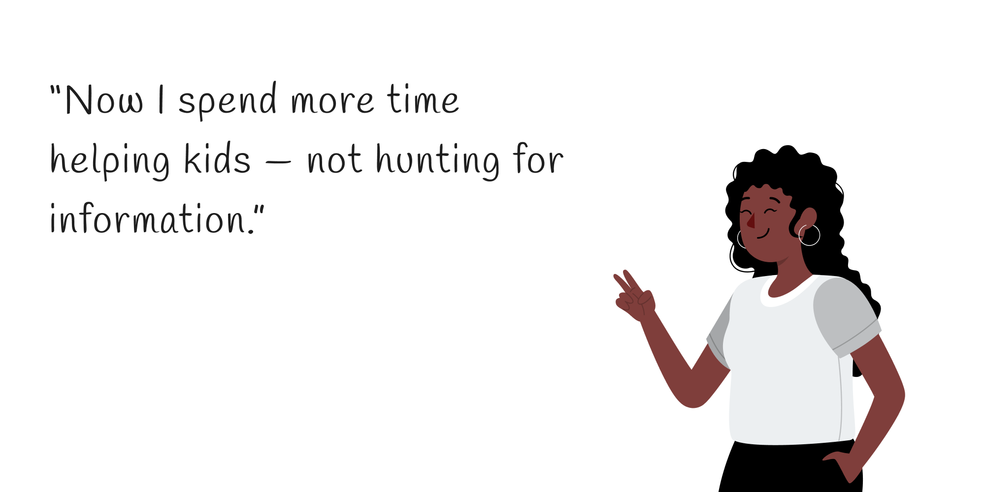
Case Managers can now identify trends 40% earlier and make decisions 3x faster, giving them significantly more time to focus on direct care for children
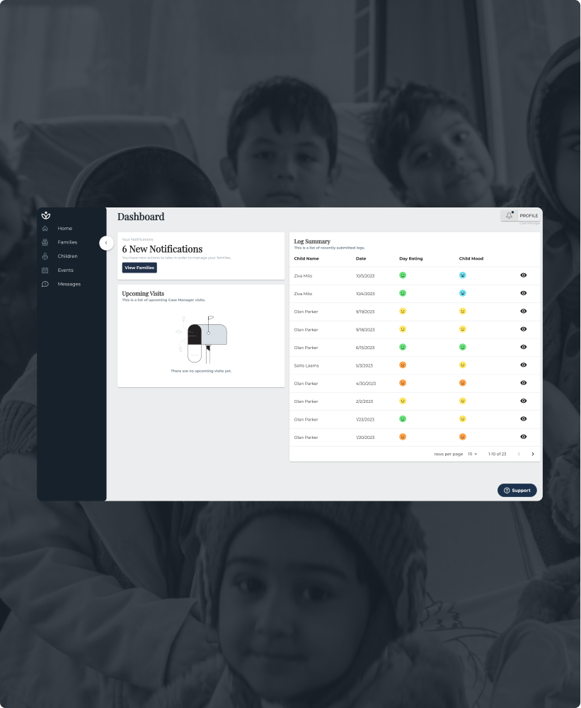
Communication Platform
The dashboard was designed to give case managers a clear, real-time view into foster home updates, helping them quickly assess a child's well-being and intervene when needed. The primary tasks dashboard helped were
01
Assessment and Monitoring
02
Communication and Support
03
Crisis Management
04
Advocacy
Research

Identifying the points of friction in their workflow
By shadowing the case managers and conducting user interviews, there were three major pain points the case managers were facing.

Lack of Monitoring
Case Managers, were getting lost behind all the data, and were not
Taking time in communication
Case managers were not effectively able to communicate and understand the

Lot of steps
There were too many steps just too look at a simple pronlem
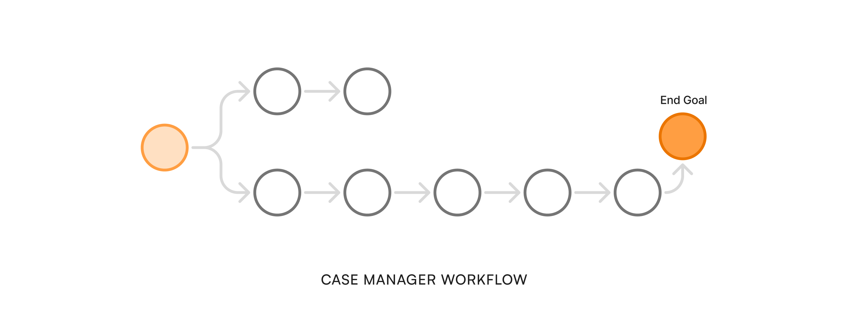
Mapping the journey
To better understand the problem, we mapped the case manager's user journey and identified key friction points. The most important task shouldn’t take this long!
"How might we redesign the dashboard to cut unnecessary clicks and surface critical information so Case Managers can spend more time with children?"

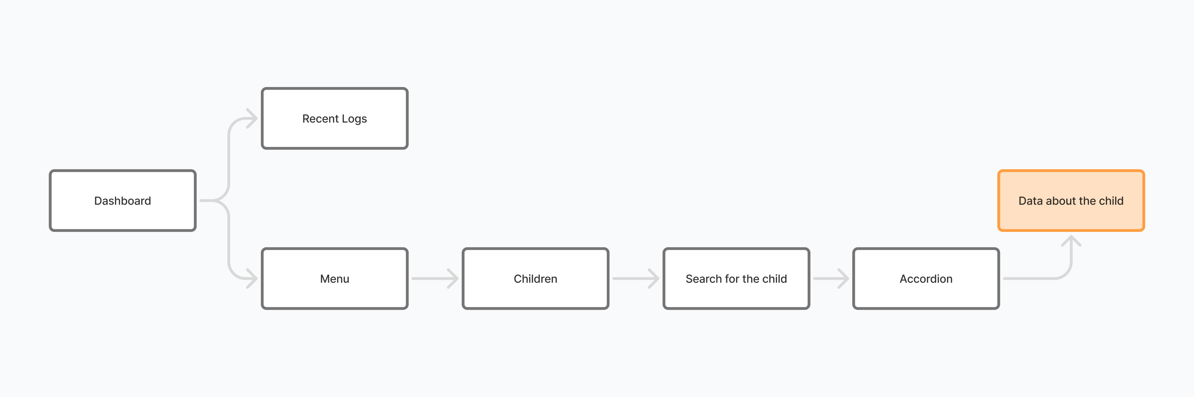
Information Architecture
Critical alerts buried under administrative data
Critical alerts buried under administrative data
Navigation Problem
12-click journeys for routine status checks
12-click journeys for routine status checks
Visual Design Flaw
No pattern visualization across multiple children
No pattern visualization across multiple children
Approach
Data That Tell a Human Story
The dashboard needed to do more than just show data – it needed to help Case Managers spot patterns and take action before issues grew.

Core Hypothesis
During the whiteboarding, we came up with the core hypothesis that could help the product.

Success Metrics
We needed to understand the value of the designed product, and this helped us understand the success of it.
Trade-offs and challenges
No design is without its set of constraints and challenges, in the span of 4 weeks we had to deliver a redesigned dashboard and there were 3 primary challenges we dealt with.
01
Legacy System Constraints
02
Limited Engineering Workload
03
Value Driven Features
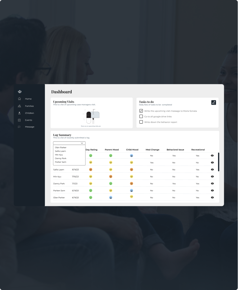
Transforming child montoring
After a lot of iterations and wireframes we were able to come up with a final product that embraced all constraints.
Reason
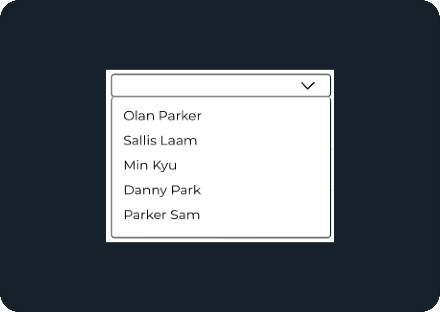
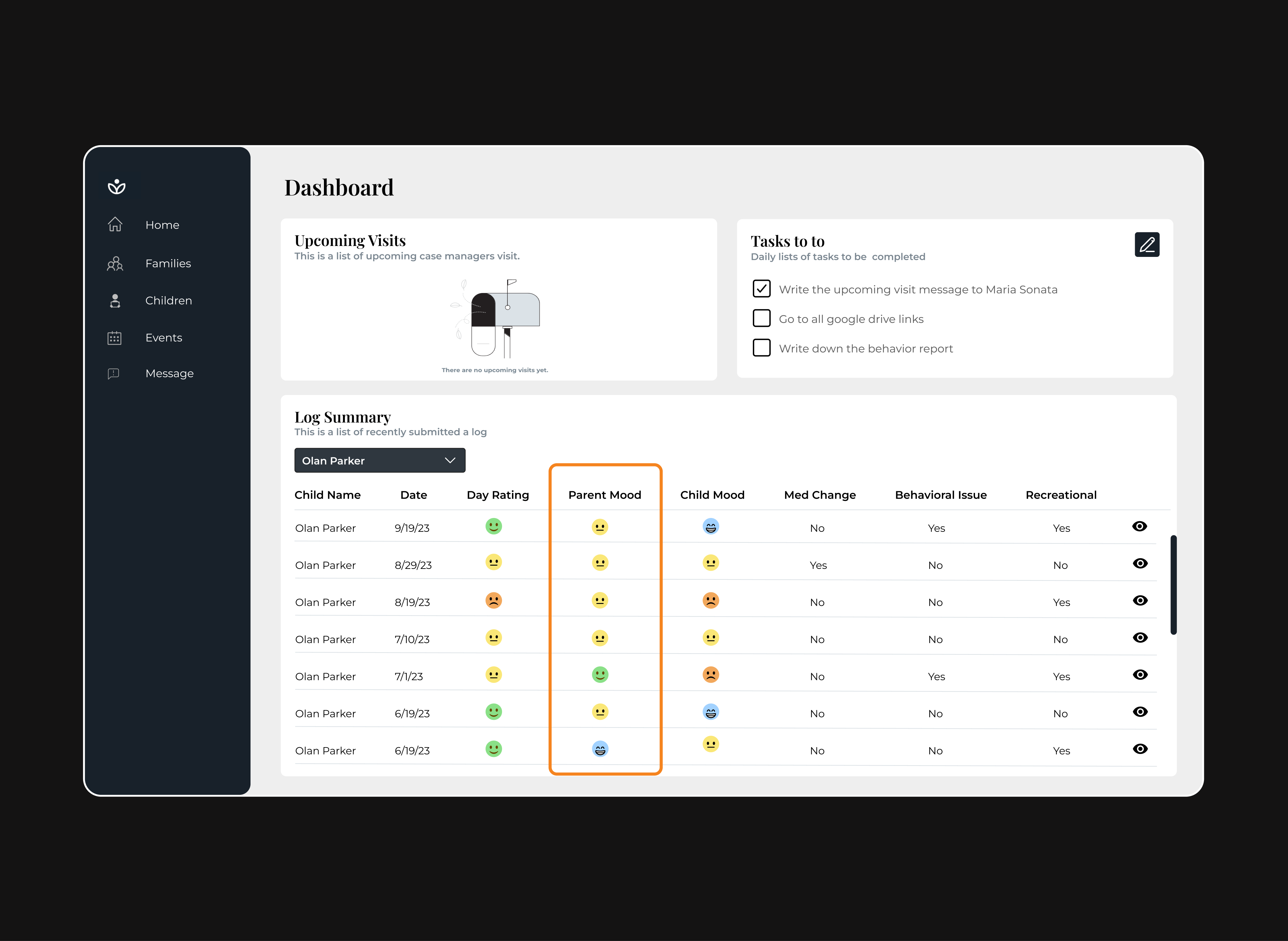
Name Filter Can be Powerful !
An efficient name filter feature enables caseworkers to quickly locate specific foster child records through text-based search.
Reason
Enhanced Data for Easier Access
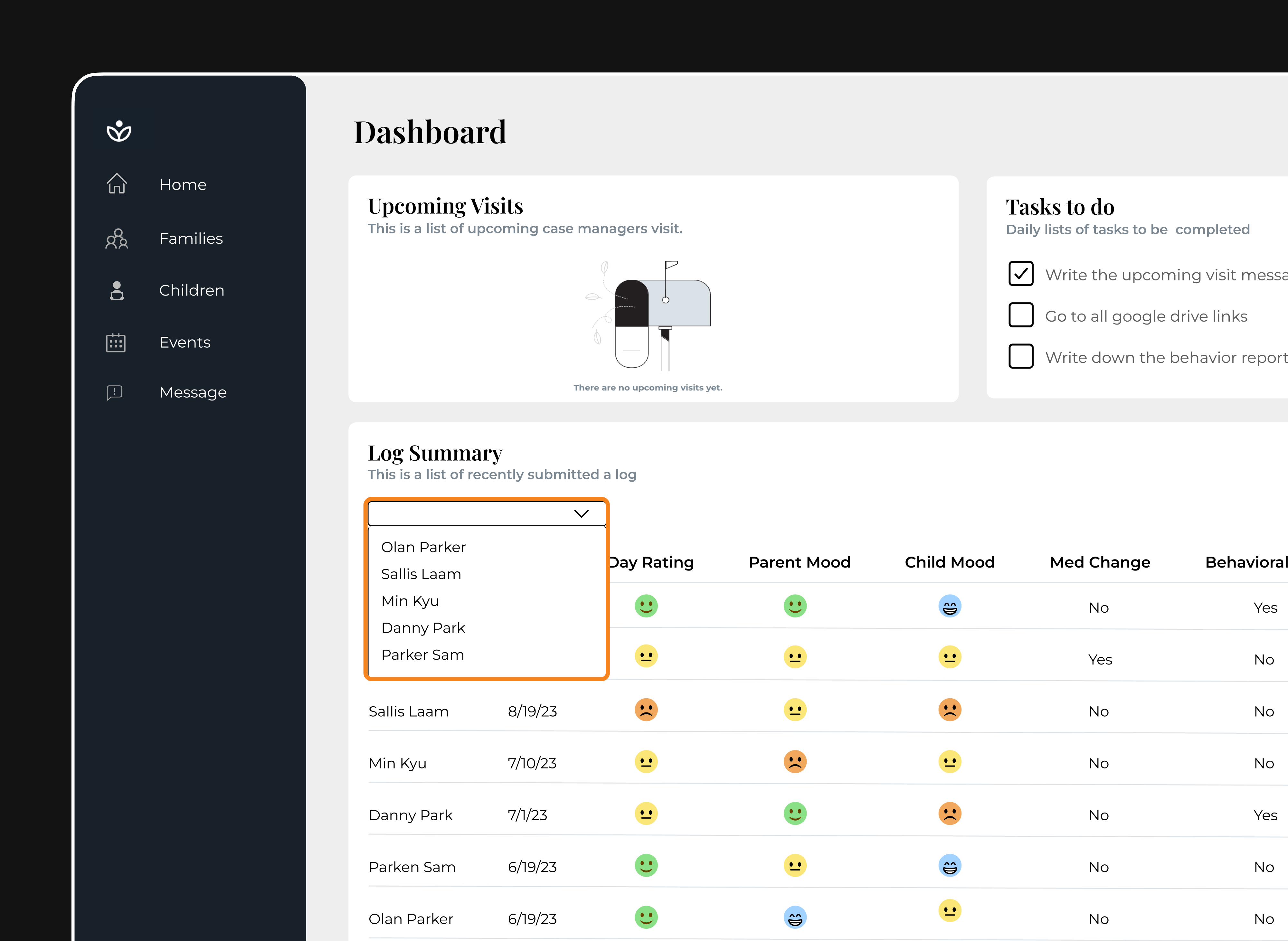
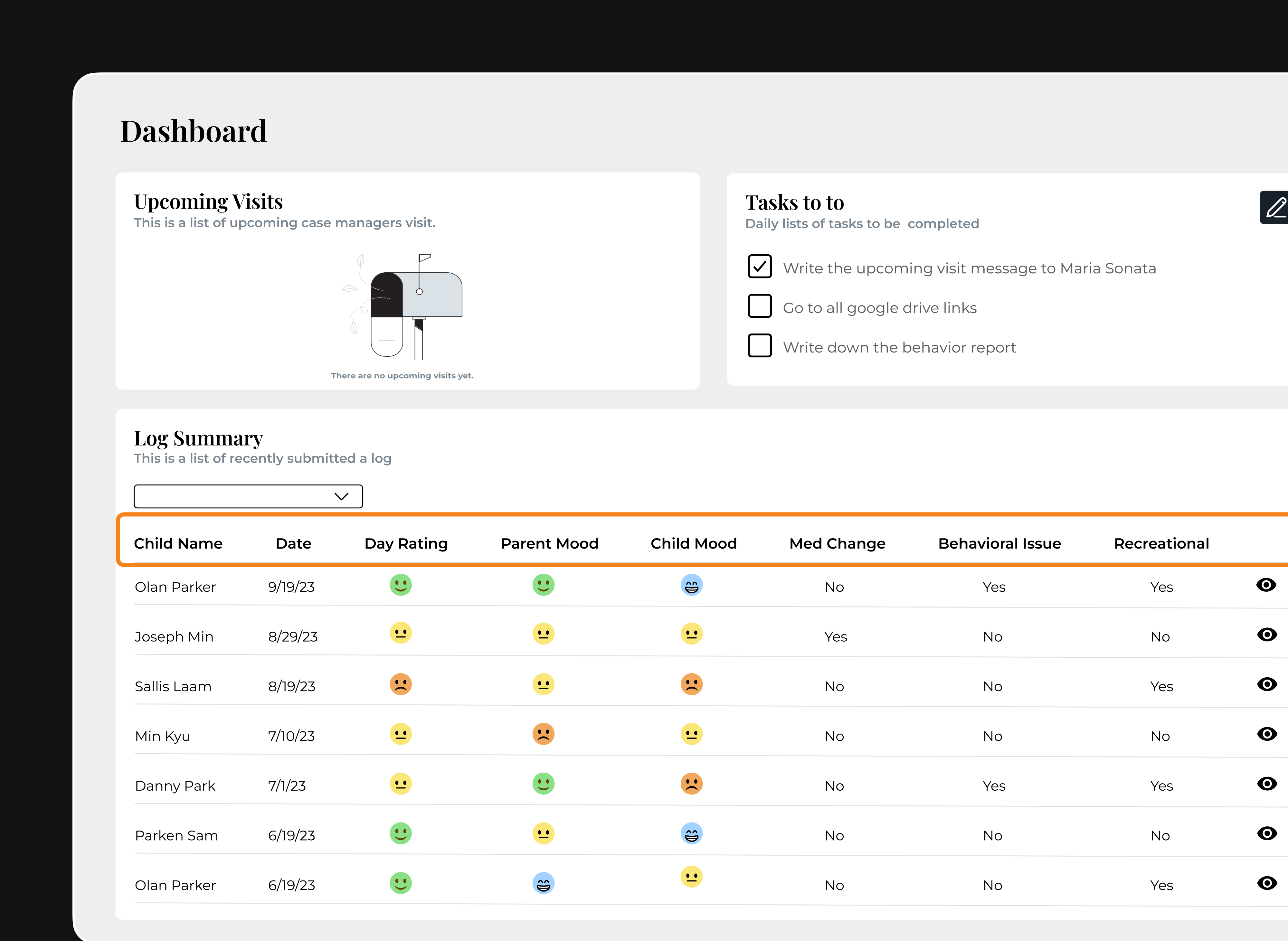
We redesigned the grid layout and enriched the homepage with additional data to enhance visualization and support more effective child monitoring.
Reason
Comprehensive Child Monitoring
The dashboard shows a personalized profile for each child, helping case managers quickly track their well-being. It brings together information like foster parent reports, medical records, and behavior updates in one place.
Growth & Next Steps
Next Steps
Following user testing, key areas to focus on forward:

Replace the legacy system with a modern Design System for consistency and scalability
Expand designs to cover additional pages and user flows
Integrate predictive insights by embedding AI to support proactive decision-making
Reflections
This project helped me grow in several ways:
Simplifying complexity: I improved at turning complex workflows into intuitive user experiences
Small changes, big impact: Even minor design tweaks can create meaningful improvements
Power of clarity: Data becomes far more actionable when presented intuitively