Valley Metro Redesign

Redesigned Valley Metro's kiosk, including both the screen and the kiosk itself.

Kiosk Design

3D Design

PrOJECT Details

ROLE:              User Research, UX Design
Tools:           Figma, Figjam, Blender
Duration:  Jan‘23 - May‘23
client:          Valley Metro (Academic Project)


Problem statement

The kiosk's design – from its screen interface to physical structure – creates unnecessary friction. What should be a quick ticket purchase turns into a frustrating puzzle, causing delays across the transit system.

SOLUTION

Our solution tackles the kiosk's complexity from every angle – screen, structure, and instructions – transforming a frustrating experience into an effortless one."

.background

Thousands rely on Valley Metro across Phoenix and Tempe. Yet one touchpoint – the ticket kiosk – turns quick stops into daily frustrations. As regular riders, we've seen passengers struggle with complex screens and hard-to-find machines, creating even bigger barriers for those with disabilities. This isn't just about buying tickets – it's about making transit work for everyone.

How might we redesign the Valley Metro kiosk to help commuters complete their tasks in seconds rather than minutes?

.research

Diving Deep Into User Needs
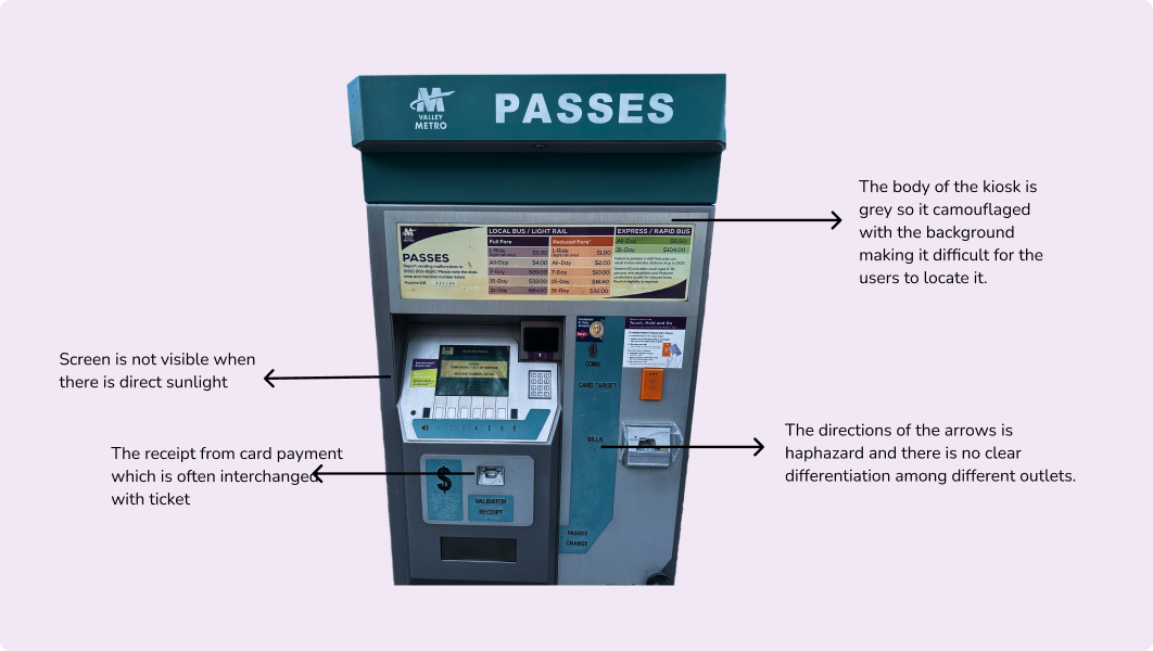
Our research confirmed that kiosk struggles weren't isolated incidents. Through various research methods, we uncovered shared pain points across different user groups, laying the foundation for an inclusive redesign.
Stakeholders
General Public:
Disabled person:
Students:
User Research Methods
Heuristic Evaluation
Contextual Inquiry
Competitive Analysis
User Interview
Survey

.research findings

The kiosk system faced several issues, which we uncovered through diverse research methods. Here are some of the pain points that we found:
Screen of the Kiosk
1. The absence of a progress indicator on the interface causes user confusion about their current stage in the process.
2. Insufficient user feedback impeded task completion and fostered confusion.
3. The lack of clear and accessible exit mechanisms can lead to user frustration and confusion..
4. The buttons on the kiosk were difficult to identify and operate, leading to confusion among the users.
Exterior of the Kiosk

.exploration

To gain deeper insights into what users desired from the redesign, we crafted personas that illuminated their frustrations and goals. This approach empowered us to create a design that catered to diverse user needs and fulfilled their respective goals.
Sofy Brown, a 32-year-old Spanish professional at a multinational corporation, rarely visits her office in Phoenix and prefers using light rails for commuting. However, the absence of an Apple Pay option and the screen's visibility issues in direct sunlight frustrate her, impacting her overall experience negatively.
John Davis, a 30-year-old currently unemployed and new to living in Tempe, relies on the light rail for commuting to various interview locations. Being a new user, during his initial encounter with the kiosk, he mistook the screen for a touch screen, causing some frustration. His first experience was challenging due to difficulties in locating the kiosk and the lack of clear instructions on how to use it, which further added to his frustration.

.user journey

To understand more about Sofy's interaction with the kiosk, we delved into understanding her user journey. This exploration allowed us to identify pain points that frustrated her during certain steps and also highlighted positive aspects of her experience with the original kiosk.
*The high points represent positive emotion and the low points represent negative emotion.

.ideation

From Research to Reality
Our research revealed two clear paths forward: reimagining both the physical kiosk and its digital heart. We needed to create something that worked for everyone, whether they preferred buttons or touchscreens.

Finding the Sweet Spot
Instead of completely replacing the familiar button system, we designed a hybrid approach. The new touchscreen interface would make ticket buying faster and more intuitive, while physical buttons remained as a trusted backup – ensuring no rider would be left behind.

.wireframe

We had to design the exteriors for the kiosk as well as the screen interface. After a few iterations, we managed to establish the flow for purchasing tickets and also finalized the exterior design.

.solution

A Fresh Take on Familiar Design
We redesigned the Valley Metro kiosk inside and out, keeping their brand identity while making every interaction simpler. The new design reduces confusion and welcomes all users, helping everyone get where they need to go faster.

Redesign of the Physical Body of the kiosk

Redesign of the Interface

Putting Riders in Control
The old kiosk left users guessing at every step. Our redesign keeps riders informed with clear status updates and simple error fixes. No more starting over – just smooth, stress-free transactions.

.reflections

Embracing New Perspectives
Every project teaches us something new. This one showed me the power of looking beyond traditional user needs. As I advocated for non-human stakeholders, I learned how design decisions ripple through the natural world, not just human lives.

Stepping Out of Our Comfort Zone:
This project pushed me far beyond familiar territory. Juggling 3D design, screen interfaces, and graphics meant learning new skills on the fly. Each challenge became an opportunity to grow, turning unfamiliar tools into new possibilities for better design."